2 BOOKS DESIGN
只留下真正需要的
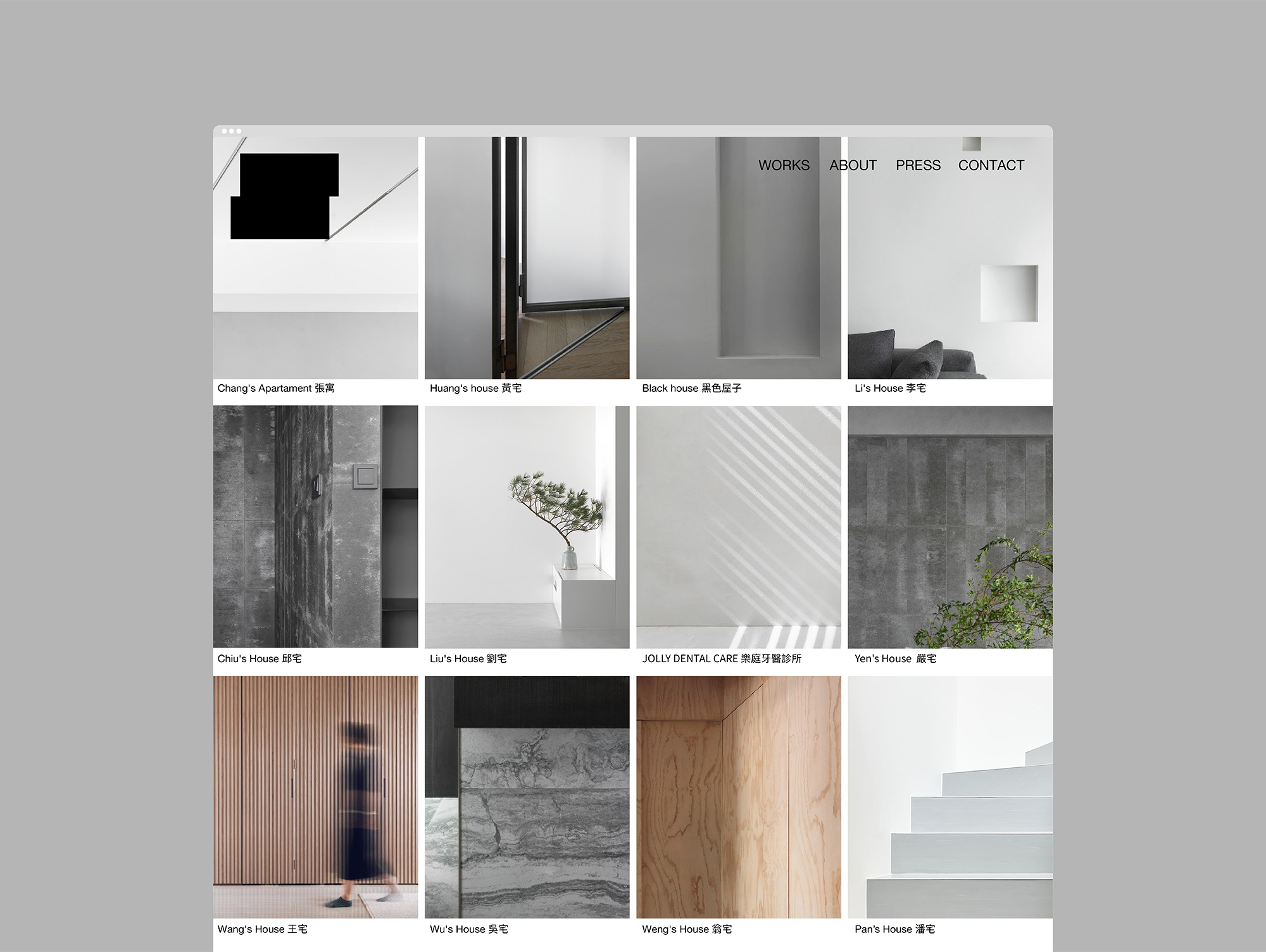
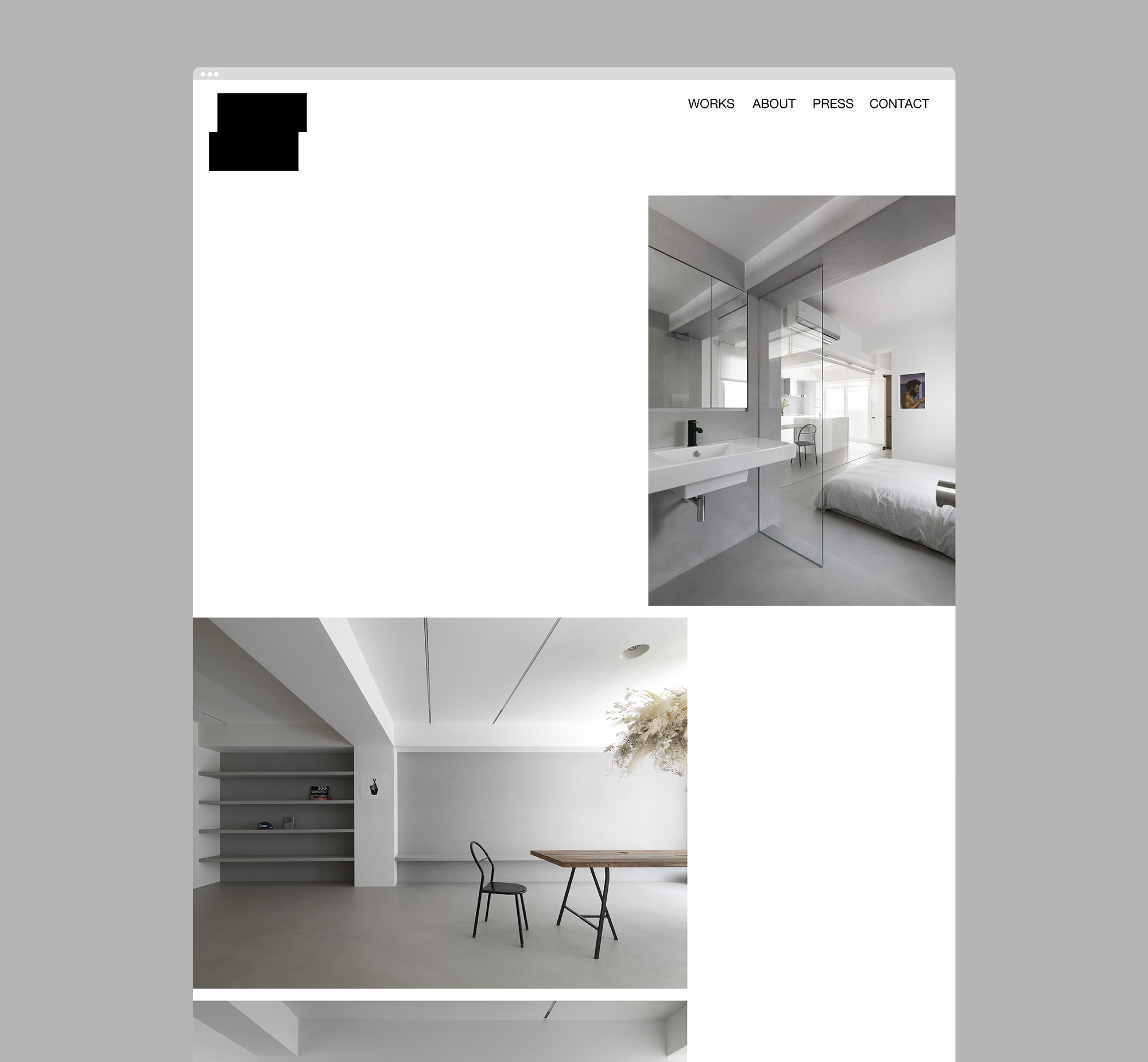
以最精簡俐落的方式,重現每個獨特的家或是空間的生活想像,這是兩冊空間製作所最擅長的事。
儘量減少過多的裝飾,留下真正需要的,尋找比例、材料與空間的平衡,進而創造簡單舒適的溫暖設計。
兩冊的命名,跟主持設計師兩個小孩的名字有關,小孩是他生活上的重心,工作上的動力來源。
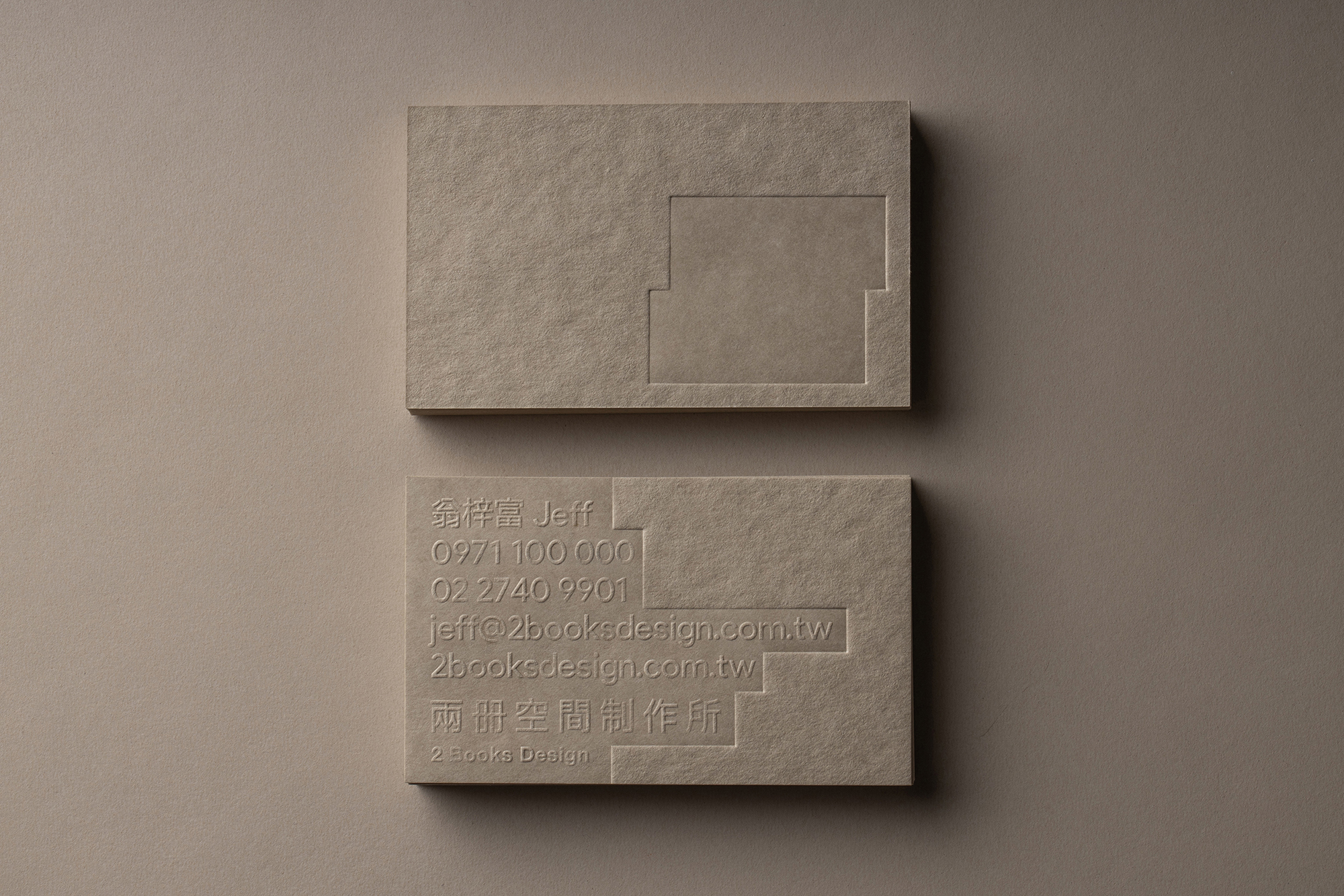
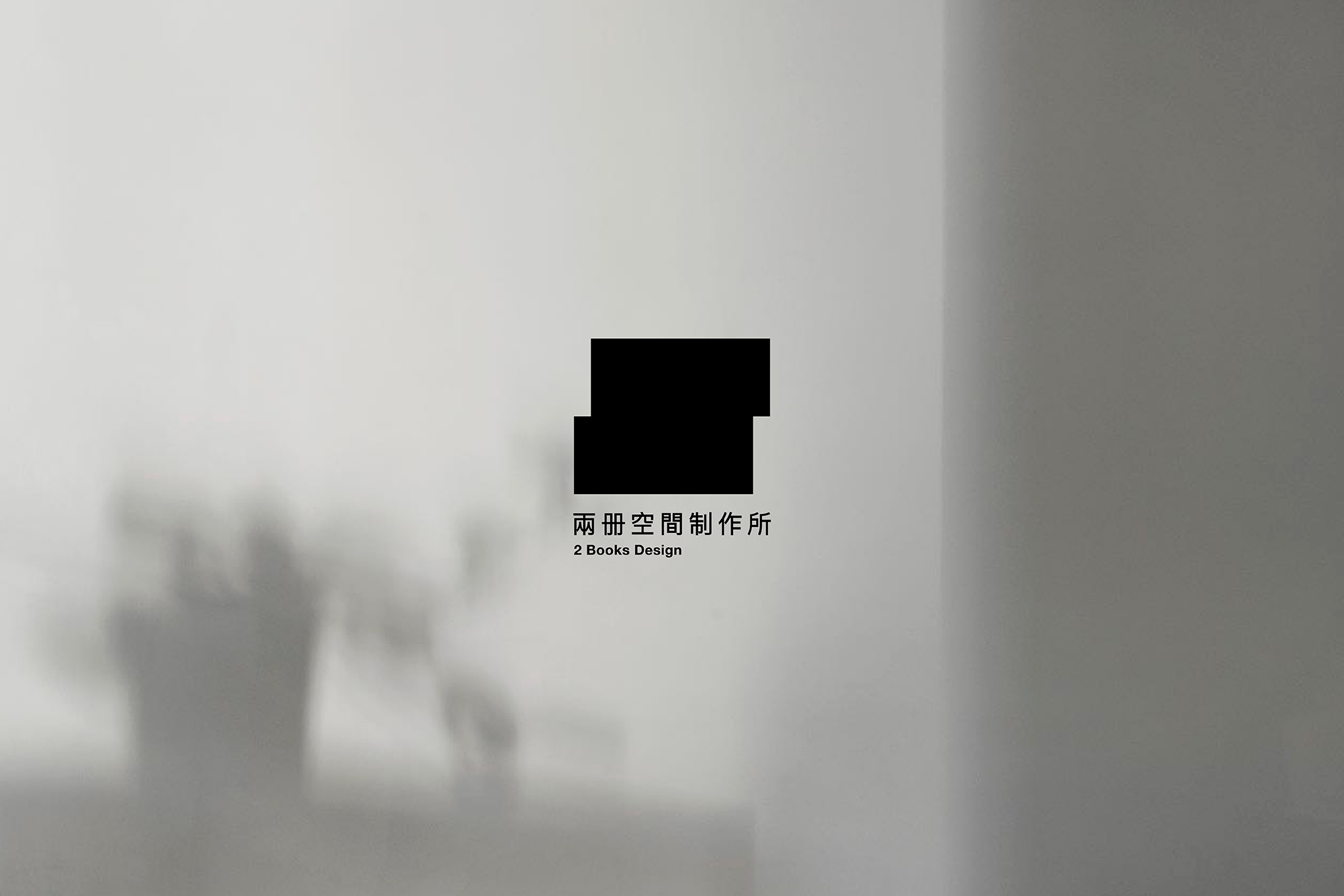
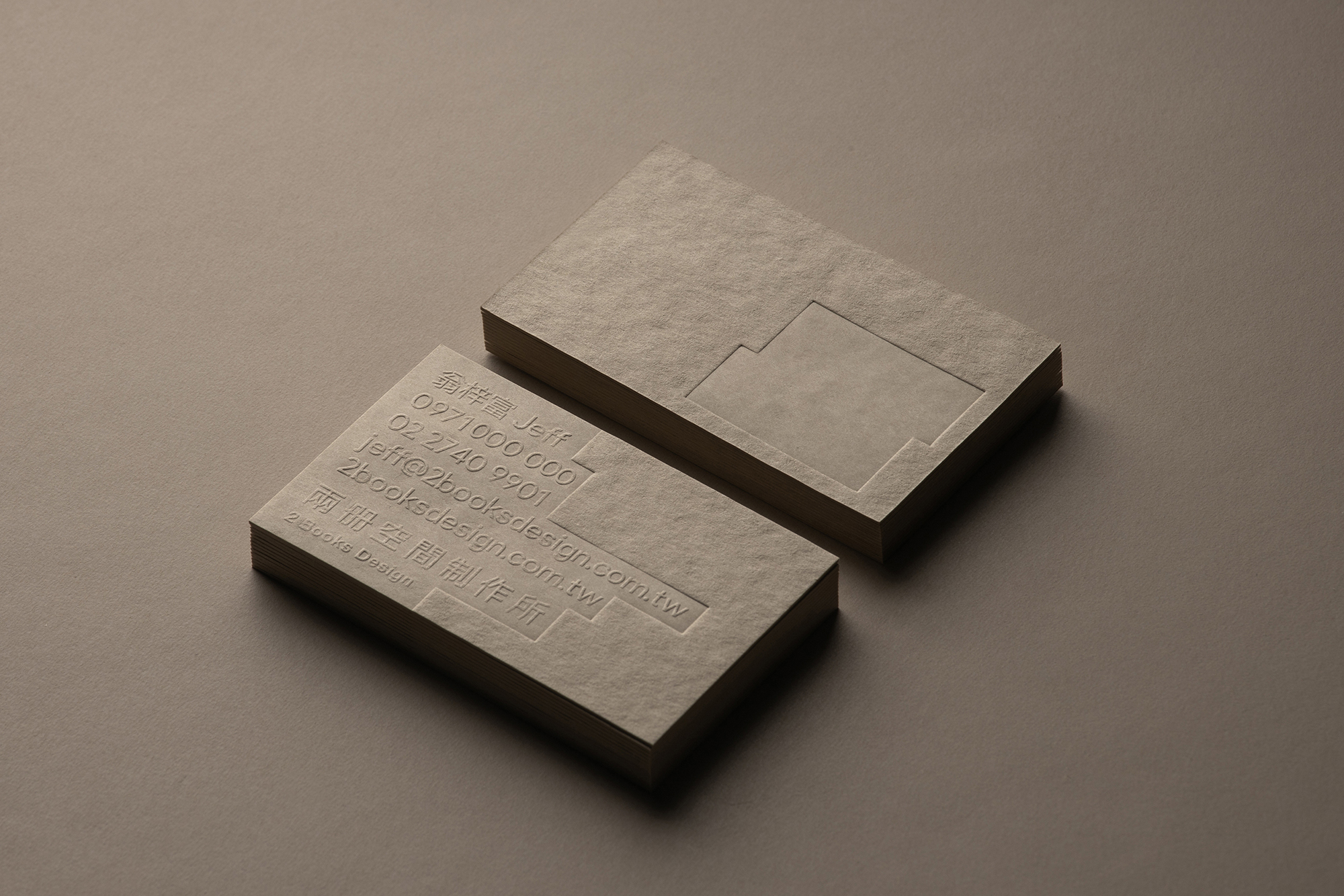
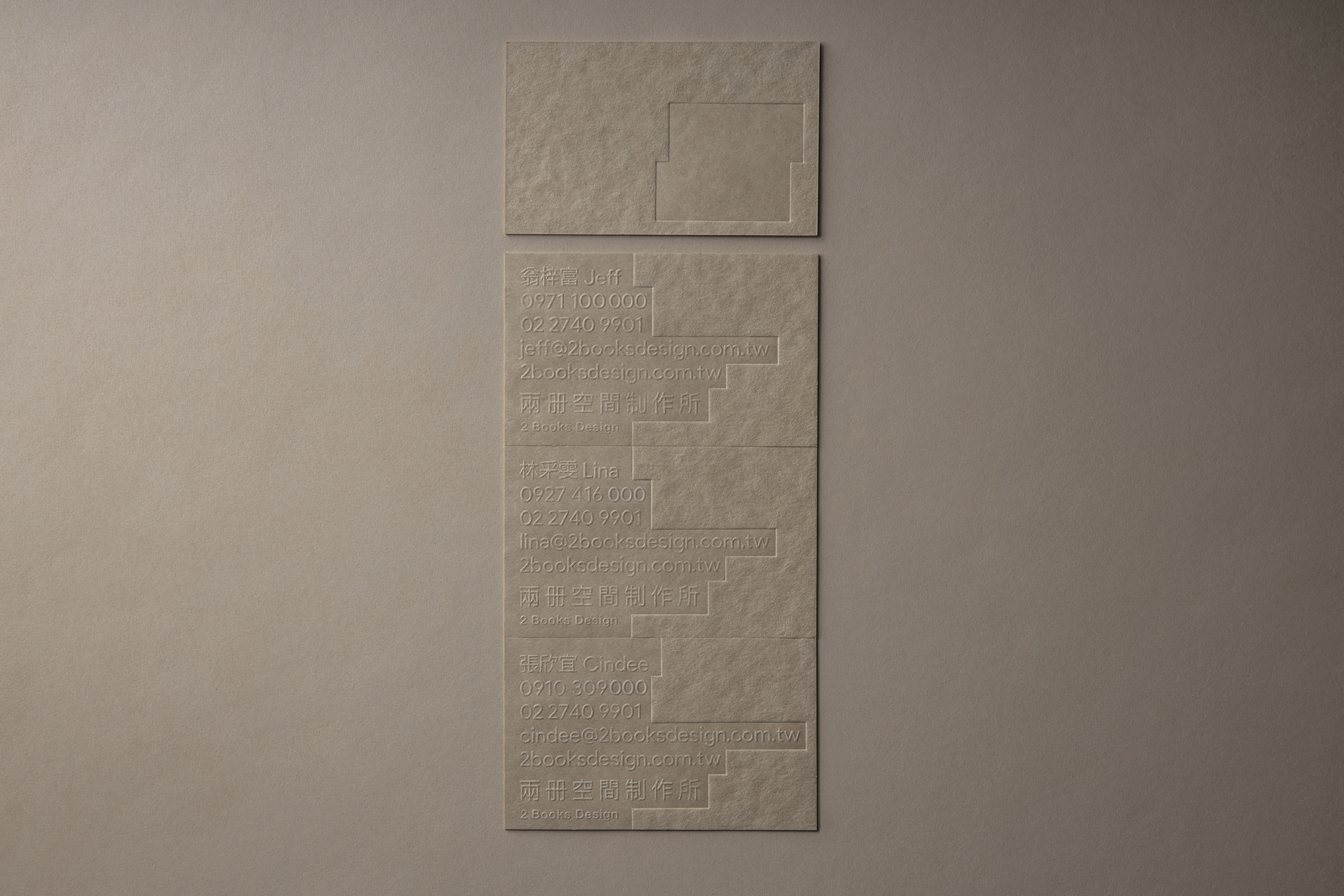
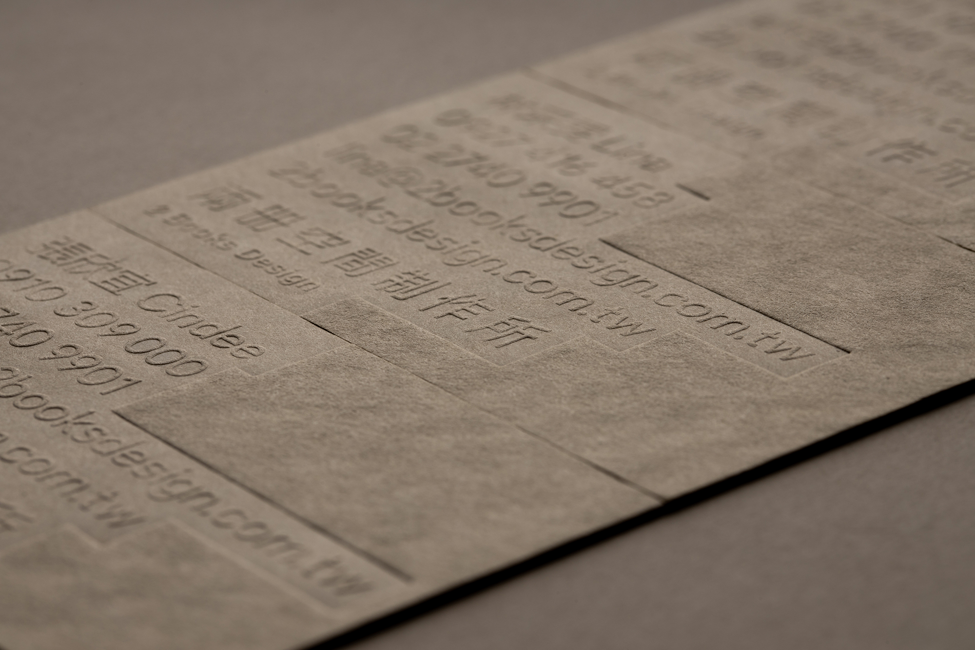
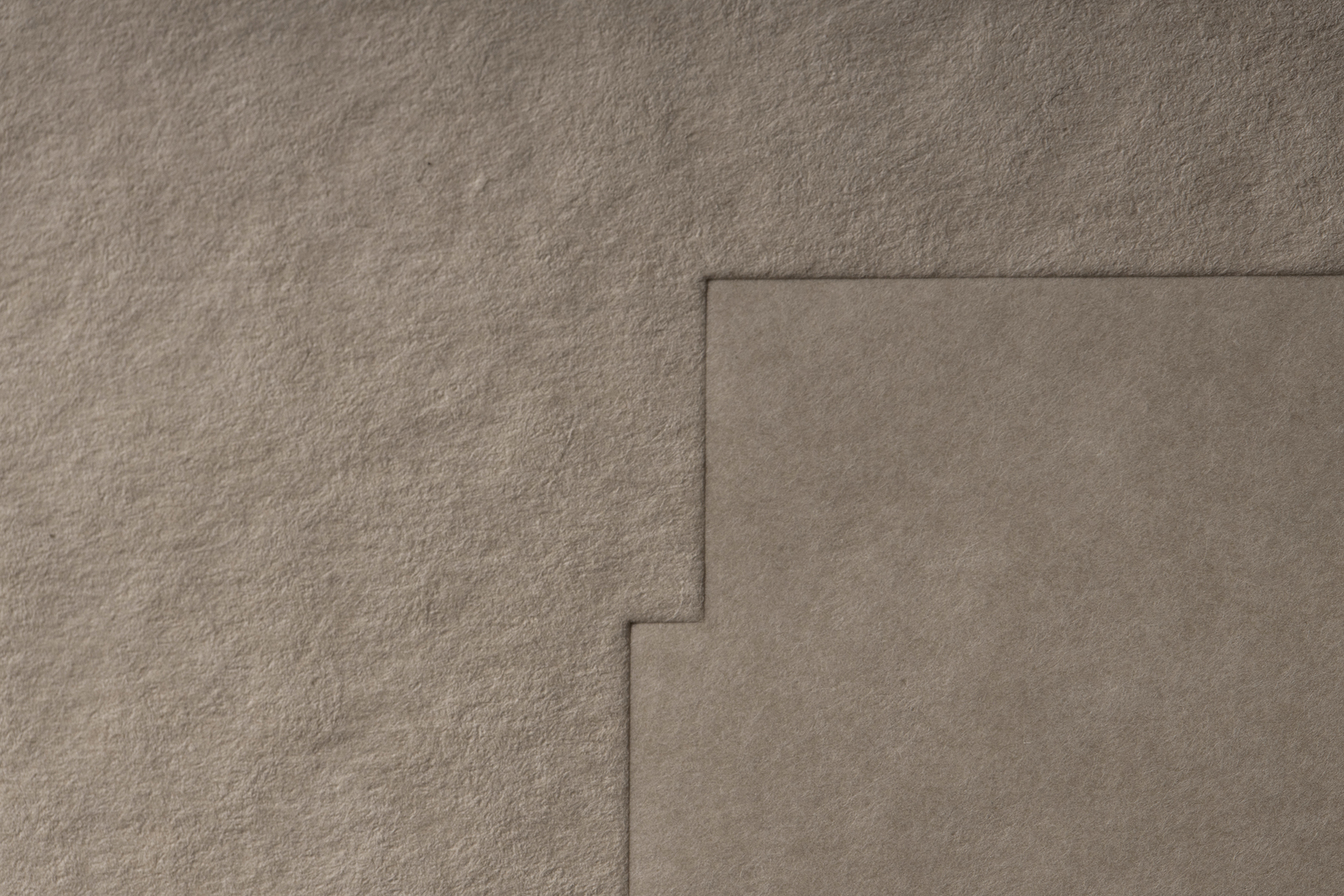
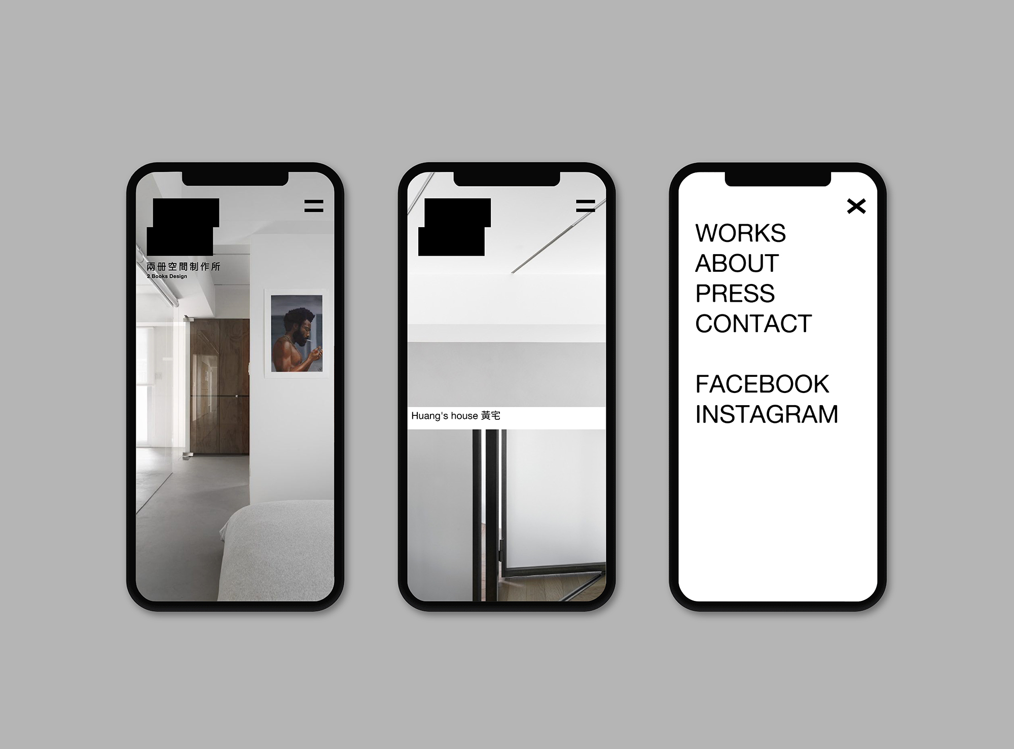
我們為兩冊空間製作所進行品牌視覺更新,延續兩冊的設計哲學,我們也盡量減少過多的設計。新LOGO象徵著兩本書的堆疊、平面的展開、空間的立體想像。
在簡單的設計中,去形塑一個舒服、現代的品牌。
Leave Only What is Really Needed
2 books design is specialized with the most streamlined way to represent the unique lifestyle of each home or space.
Minimize excessive decoration, leave what is really needed, find the balance of proportion, material and space, and create a simple and comfortable space are their design philosophy.
The naming of 2 books is related to the names of the owner’s two children. The children are the focus of his life and the motivation for his work.
We redesign the visual identity of 2 books design and also try to minimize excessive design in order to meet their philosophy. The new logo symbolizes the stacking of two books, the expansion of the plane, and the 3 dimensional imagination of space. A symbol to shape a comfortable and modern looking of the brand.
Year : 2020
Client : 2 Books Design
AD&D : Ho Wan Chun