CONTACT BOOK
新北市108年上學期國中品德教育聯絡簿
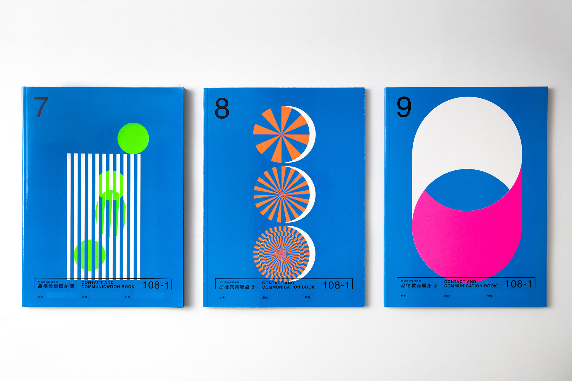
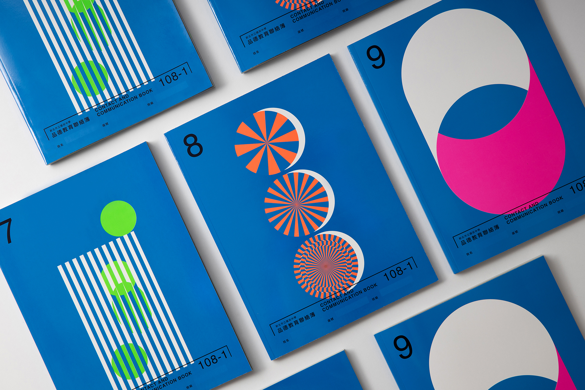
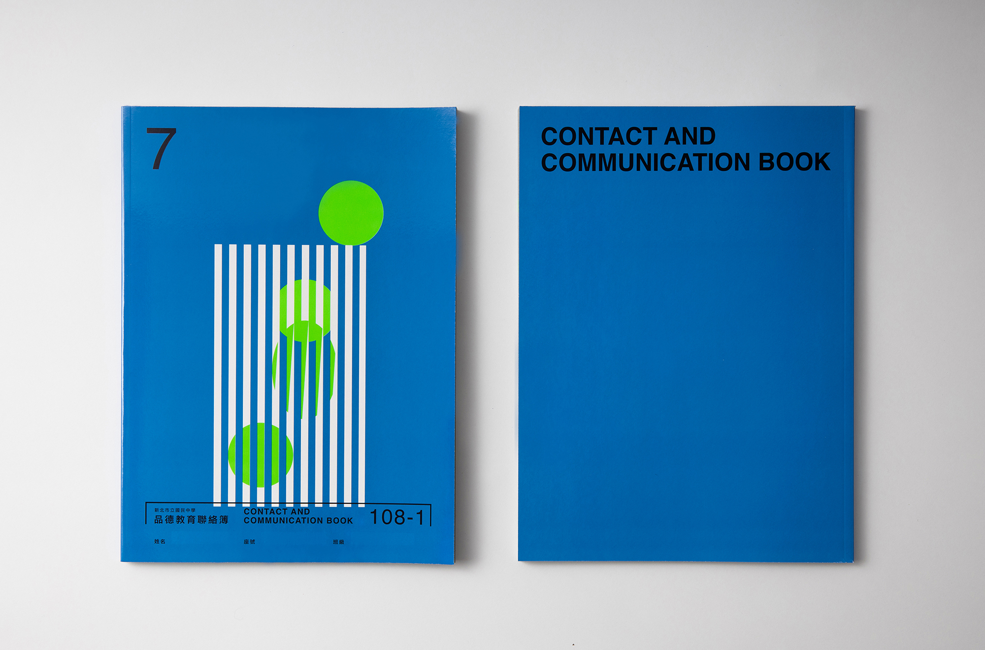
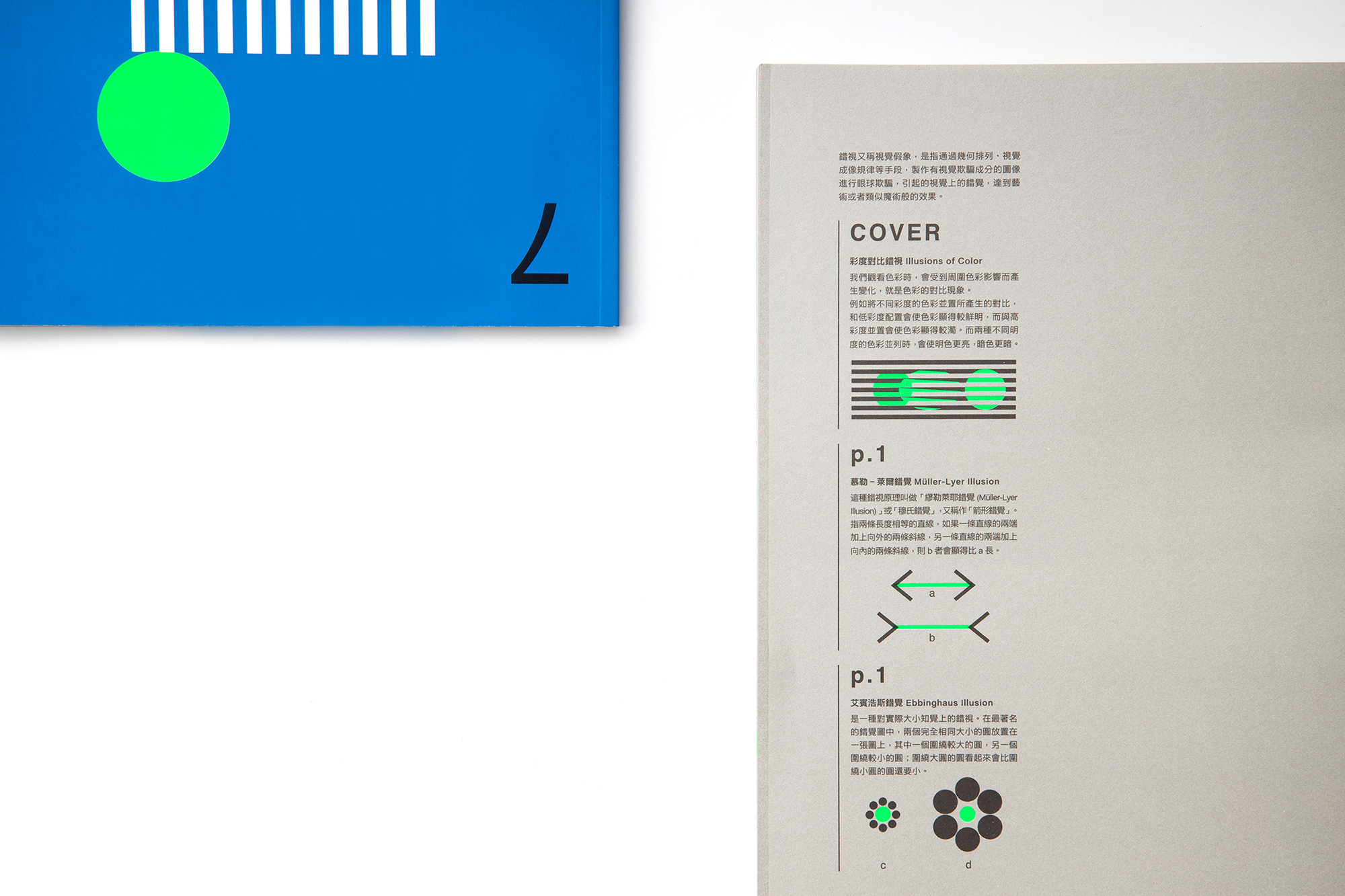
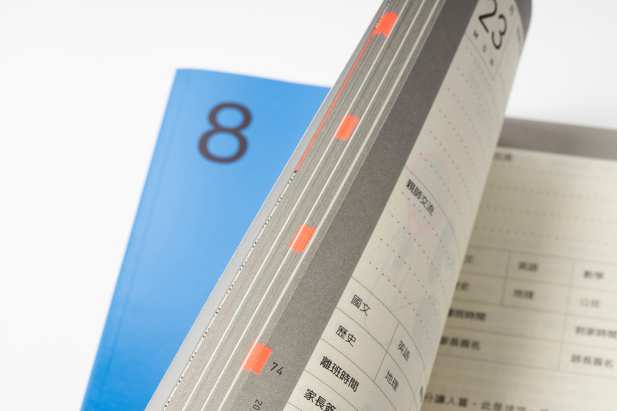
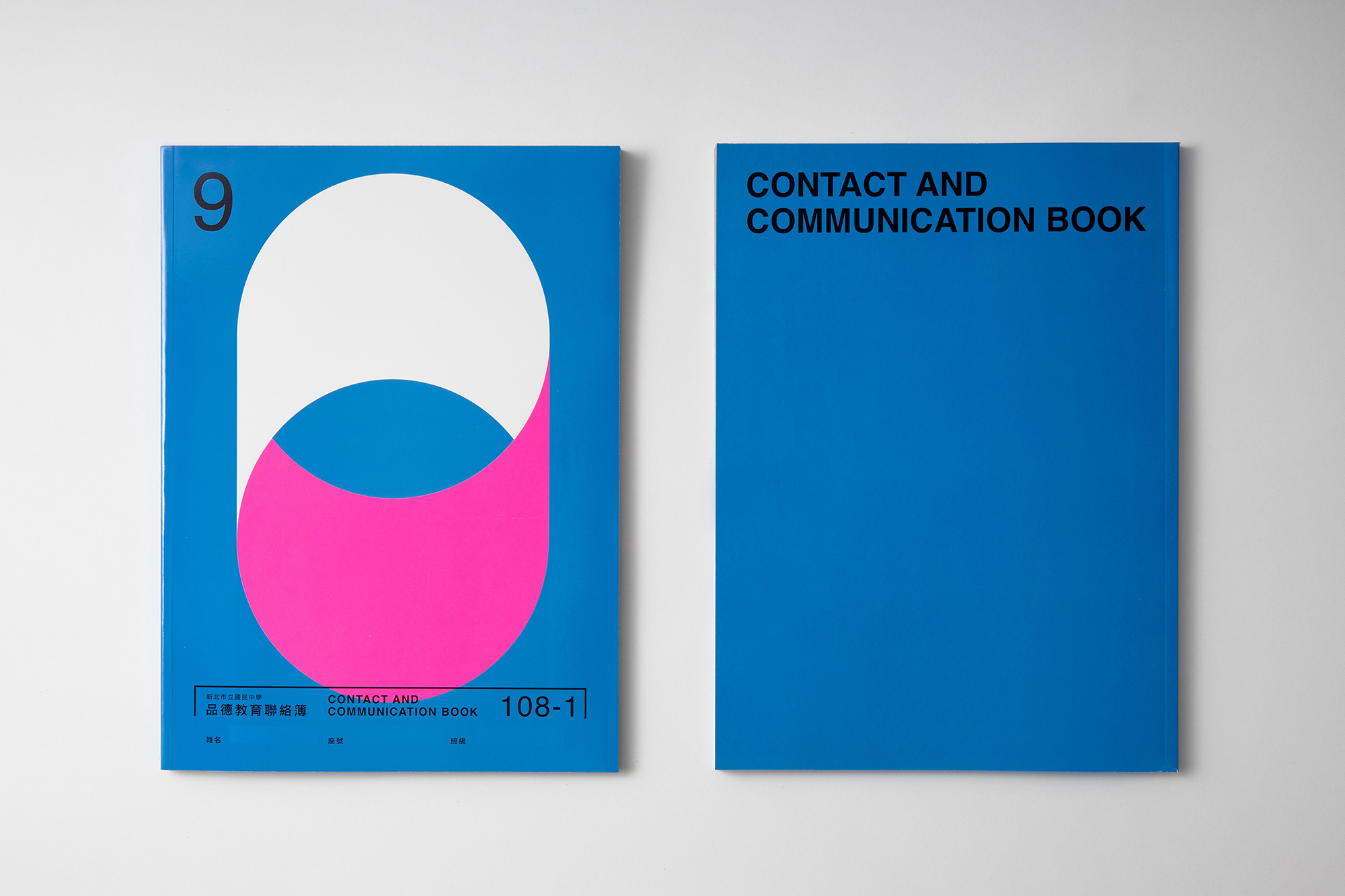
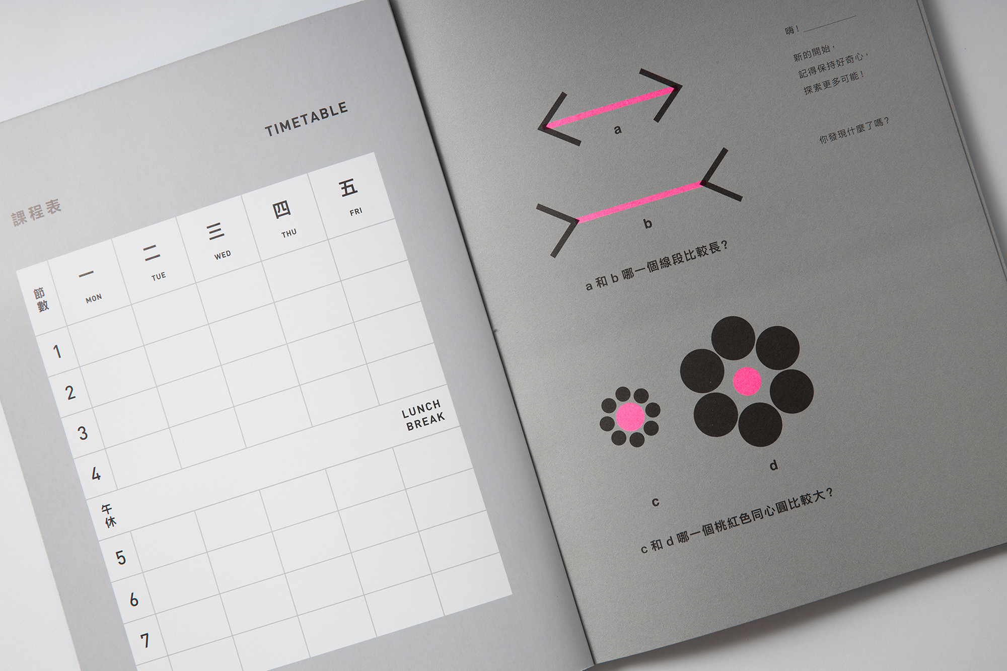
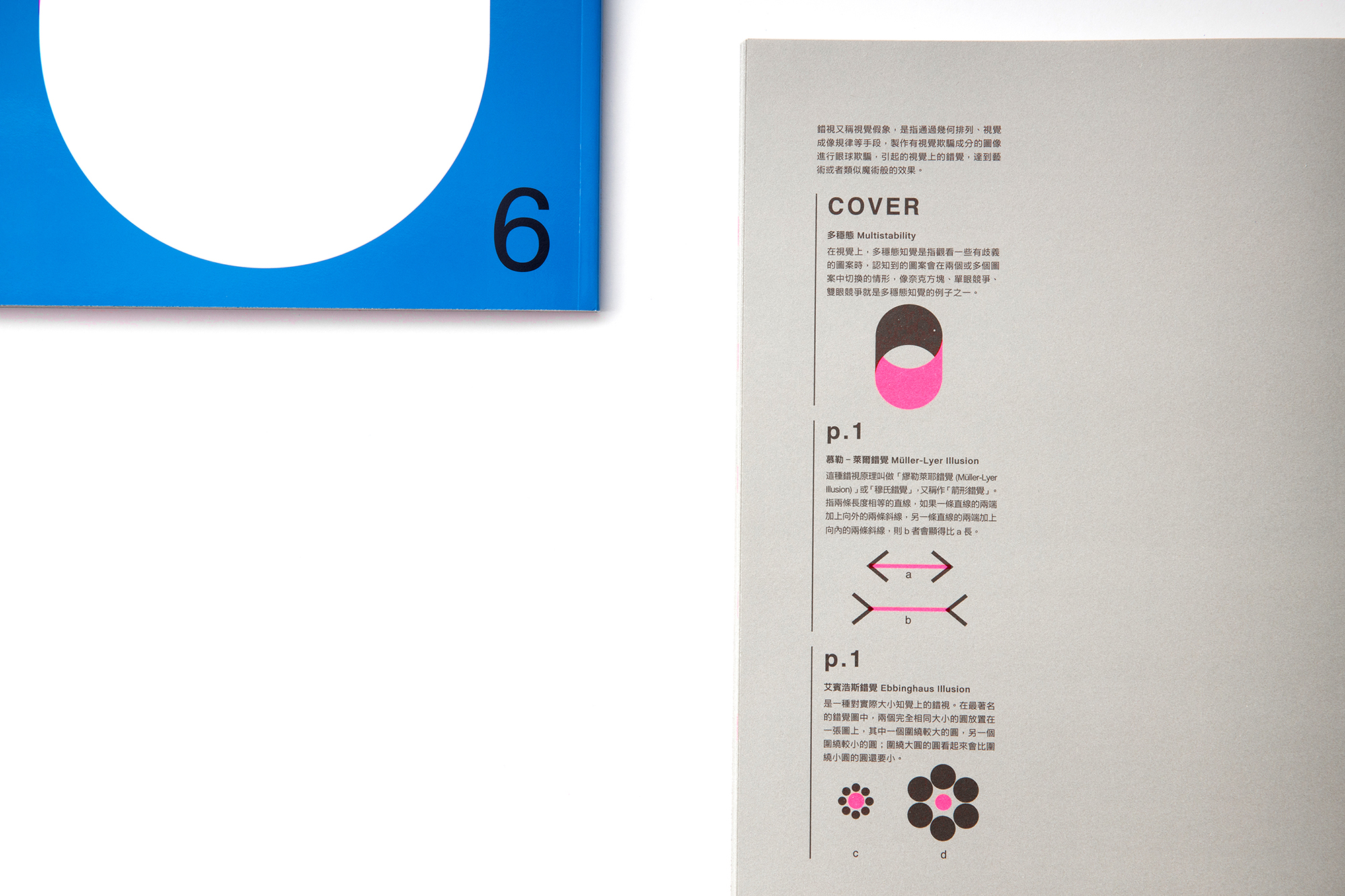
HOUTH受美感細胞團隊之邀,設計新北市108年上學期國中品德教育聯絡簿,封面以幾何圖形作為主要視覺元素,不同去年以插畫、影像為主,目的是讓封面可以延續不同的表現形式與風格,給予學生更多元的美感刺激;同時,使用視覺錯視的概念來詮釋這學期三年級的主軸,企圖將美學教育置入聯絡簿之中。
視覺錯視效果與設計主題
七年級(會變色的綠):彩度對比錯視/新環境的融入
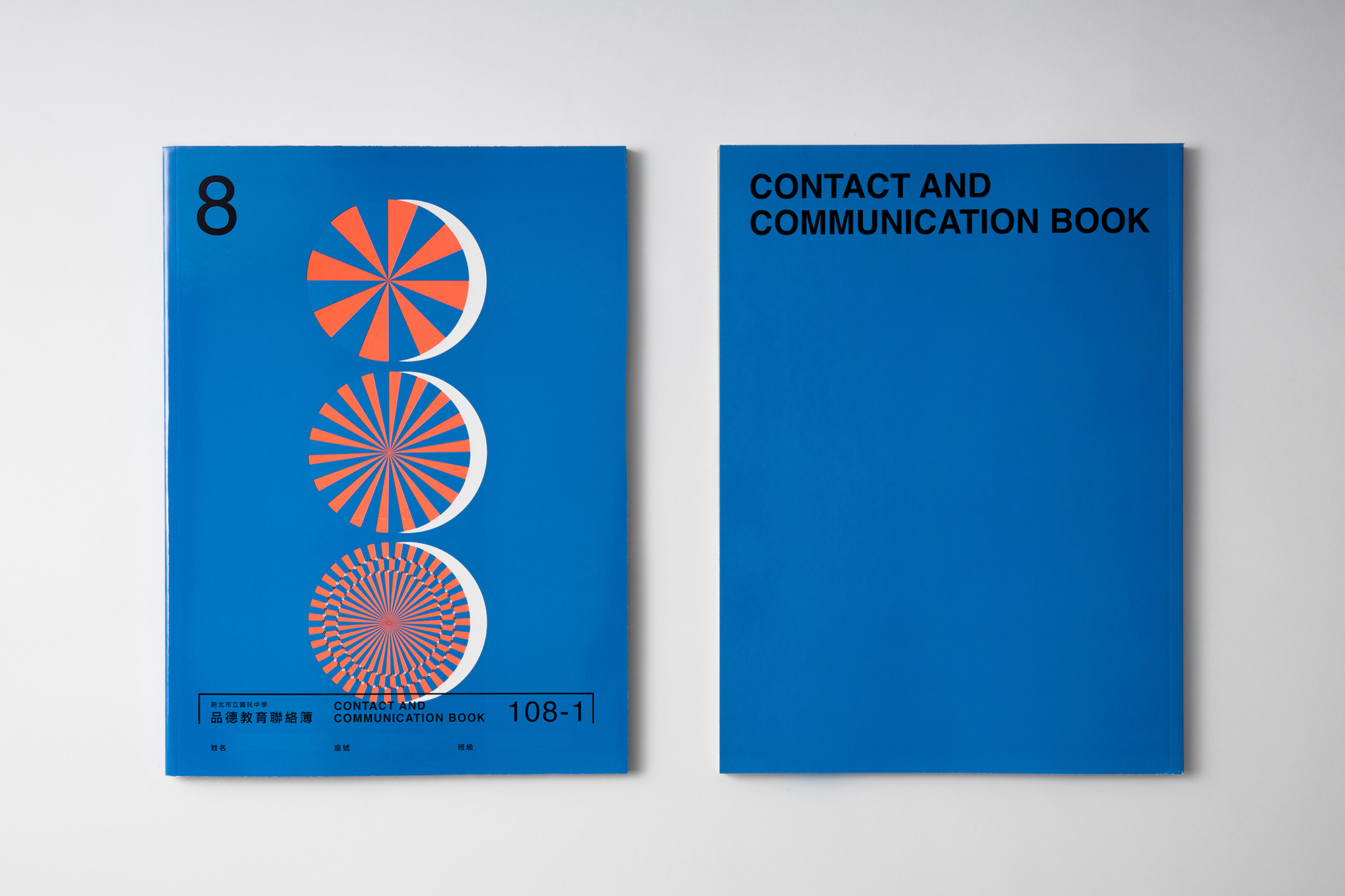
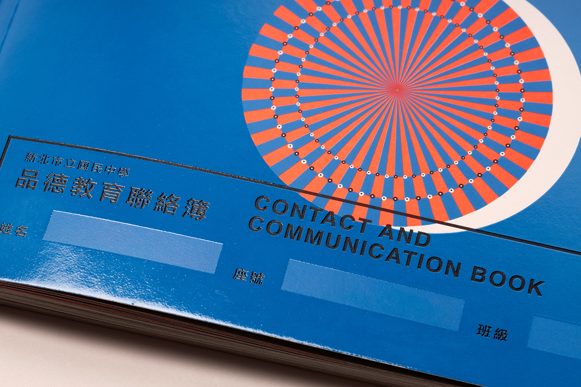
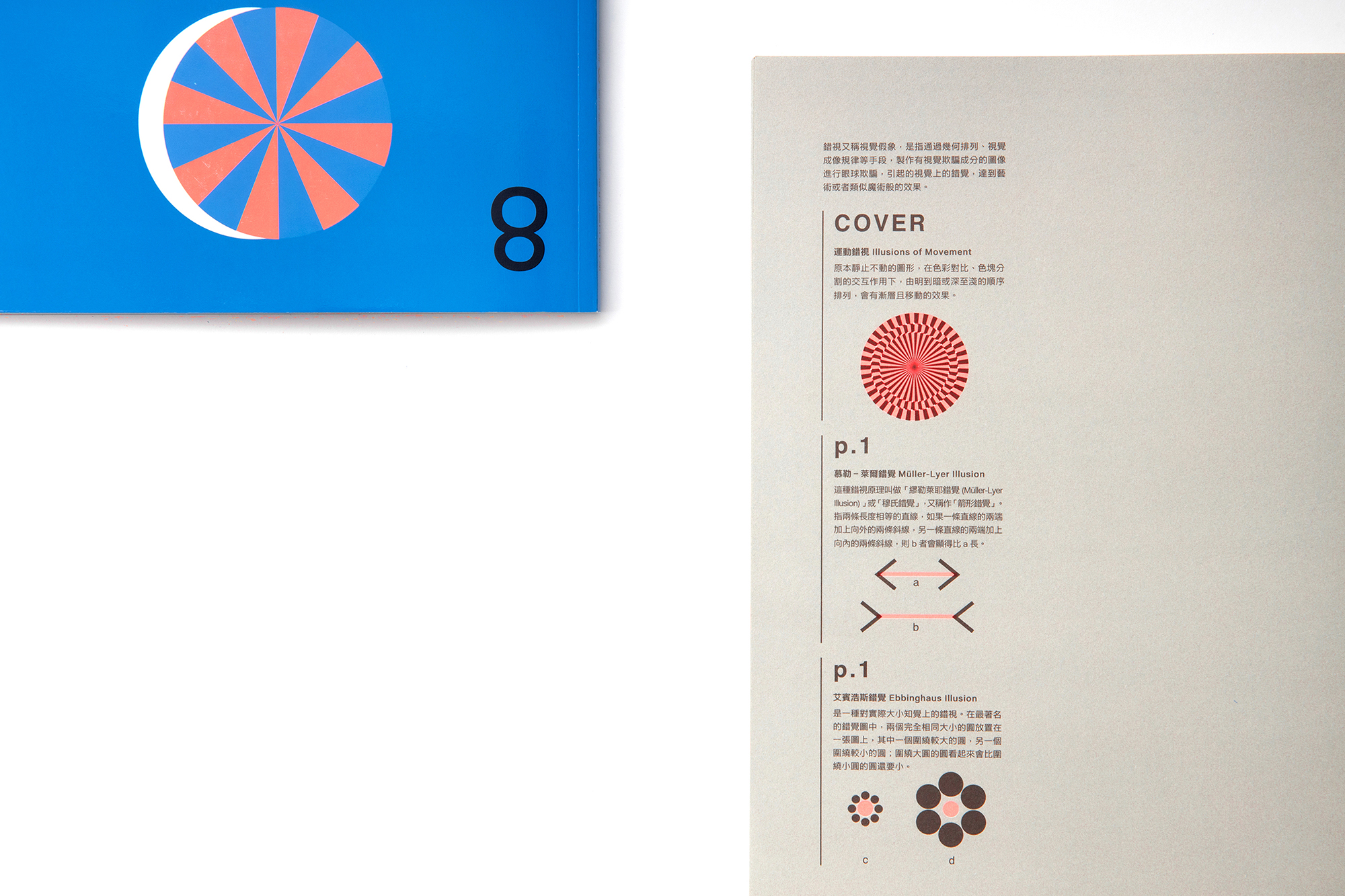
八年級(會旋轉的圓):運動錯視/生活圈的網絡擴展
九年級(會翻轉的路徑):多穩態知覺/自我反思的選擇
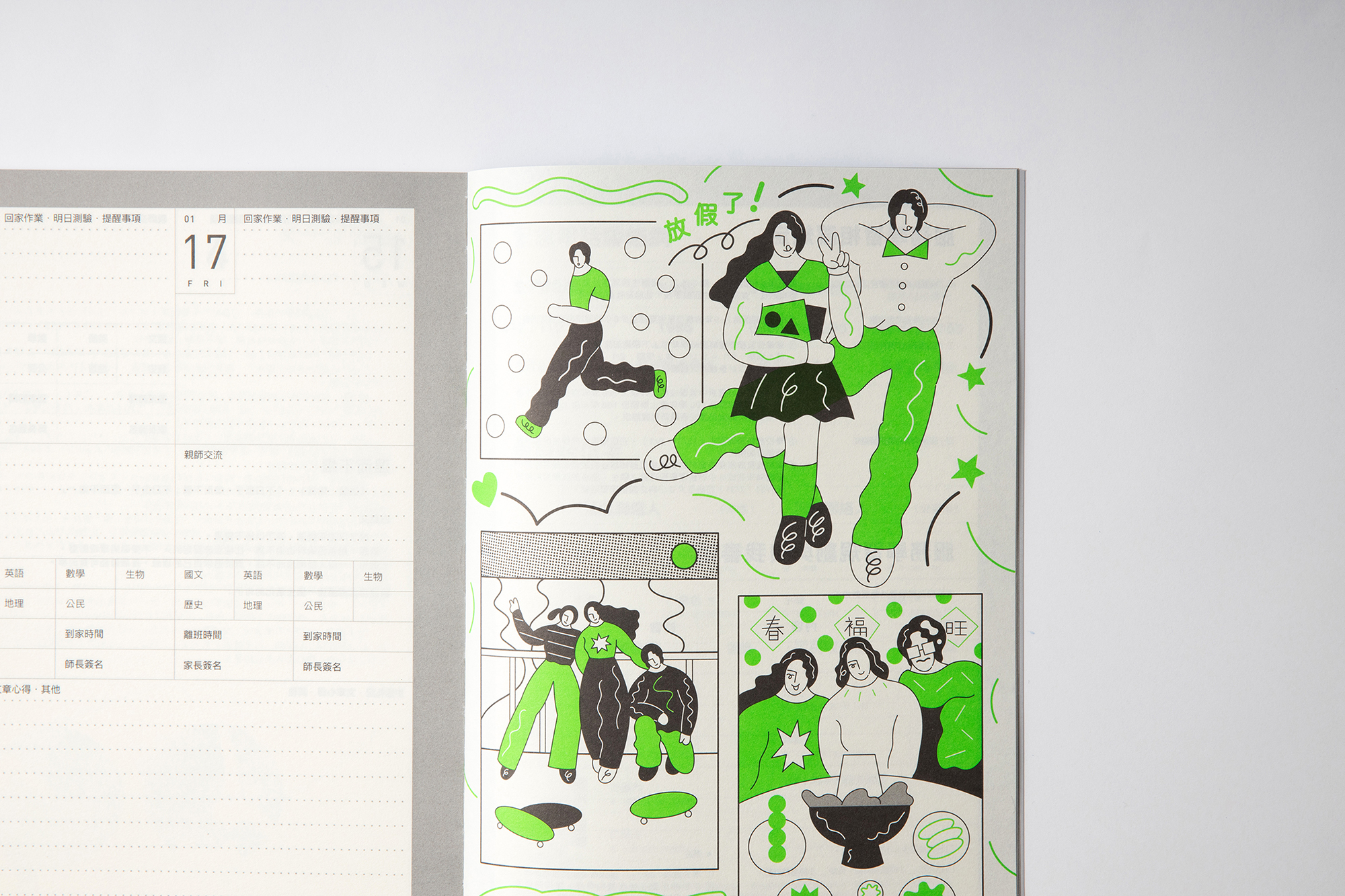
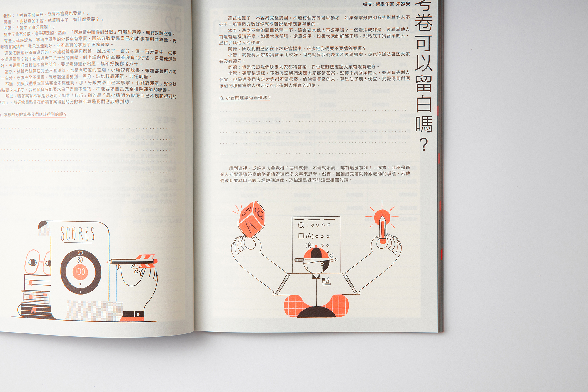
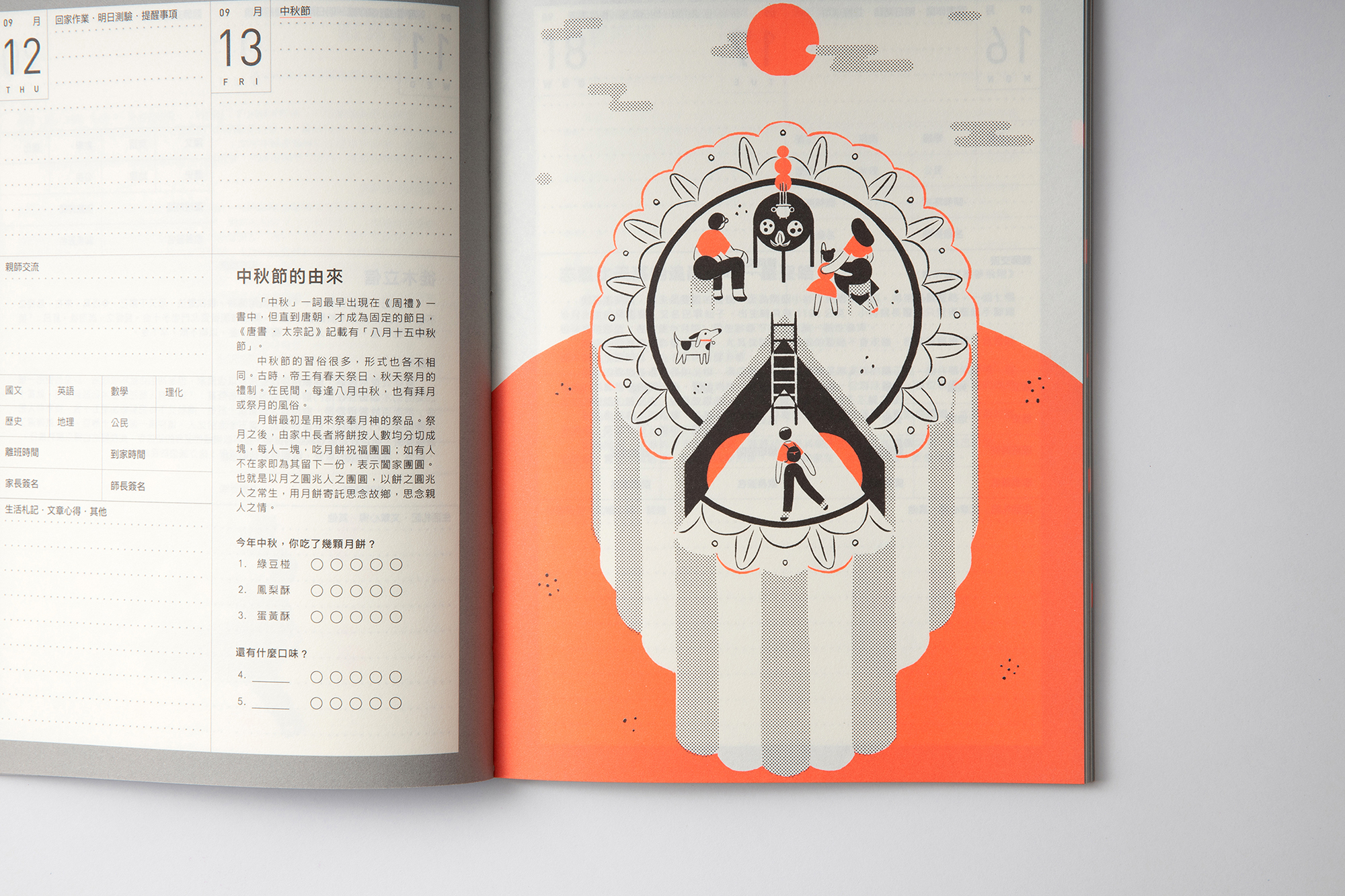
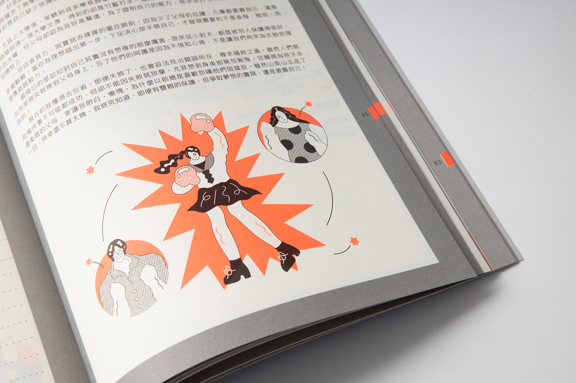
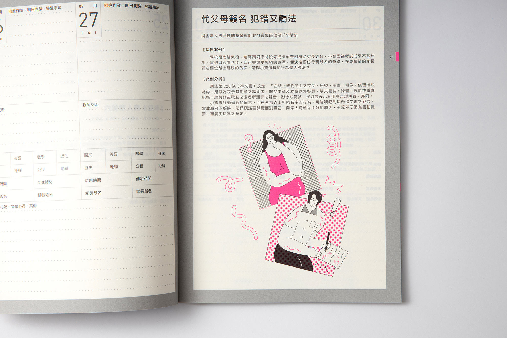
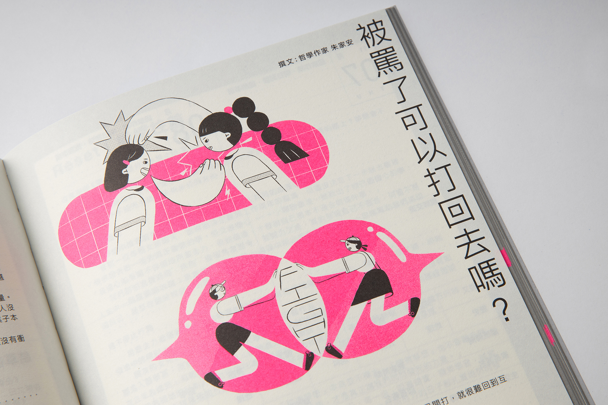
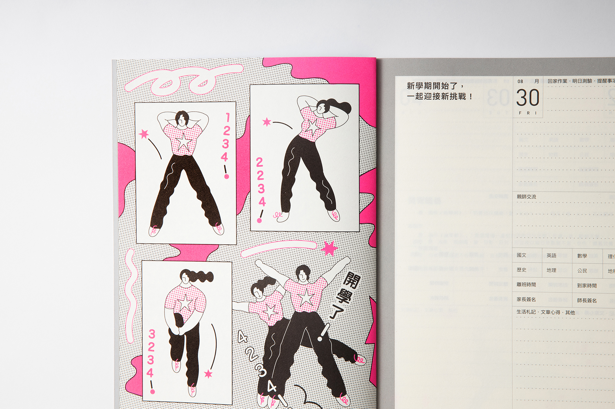
HOUTH一起邀請插畫家周依與李竺潔執行內頁的插畫設計,讓學生可以在一本聯絡簿上,感受不同的的詮釋主題的觀點與插畫想像,來發掘創作多元傳達的觀點。
Contact Book Design
The junior high school contact book is known as a communication book between students, teachers and parents. But it’s also a good opportunity to help students develop and build up the aesthetic sense. HOUTH got invited and redesign the 2019 1st semester junior high school contact book for Education Department New Taipei City Government.
In order to showcase the different cover visual format and style, HOUTH use geometric shapes as the Key elements in book covers, which different from the earlier illustration and photography covers, to create the vivid eye catching new covers. Not only “Visual Illusion” is the concept behind the cover design, but also the students’ “State of Mind”.
The Cover story are below:
7th Grade
Use illusions of color to make the changing green to imply the state of mind to fit in the new environment.
8th Grade
Use illusions of movement to make the turning circles to imply the state of mind of dynamic networking situation.
9th Grade
Use imultistability to make the flip path to imply the state of mind of self reflection.
HOUTH also invited 2 talented new illustrators to create fresh but unique drawings in the book to show the different style and perspectives between everyone.


Year : 2019
Project Coordinator : Aestheticell
Client : Aestheticell
CD : HOUTH
Cover : Ho Wan Chun
Illustration : Chou Yi, Lee Chu Chieh
Layout : 黃郁惠
Writer : 朱家安
Publisher : Education Dept., New Taipei City Government
